Supervised learning with Scikit-learn
This Jupyter notebook contains the Datacamp exercises and some of my personal notes. If you're interested in learning this subject have a look at: https://campus.datacamp.com/courses/supervised-learning-with-scikit-learn
Supervised Learning with scikit-learn
Machine learning is the field that teaches machines and computers to learn from existing data to make predictions on new data: Will a tumor be benign or malignant? Which of your customers will take their business elsewhere? Is a particular email spam? In this course, you'll learn how to use Python to perform supervised learning, an essential component of machine learning. You'll learn how to build predictive models, tune their parameters, and determine how well they will perform with unseen data—all while using real world datasets. You'll be using scikit-learn, one of the most popular and user-friendly machine learning libraries for Python.
Machine learning is the science and art of giving computers the ability to learn to make decisions from data without being explicitly programmed. For example, your computer can learn to predict whether an email is spam or not spam given its content and sender. Another example: your computer can learn to cluster, say, Wikipedia entries, into different categories based on the words they contain. It could then assign any new Wikipedia article to one of the existing clusters. Notice that, in the first example, we are trying to predict a particular class label, that is, spam or not spam. In the second example, there is no such label. When there are labels present, we call it supervised learning. When there are no labels present, we call it unsupervised learning.
Unsupervised learning Unsupervised learning, in essence, is the machine learning task of uncovering hidden patterns and structures from unlabeled data. For example, a business may wish to group its customers into distinct categories based on their purchasing behavior without knowing in advance what these categories maybe. This is known as clustering, one branch of unsupervised learning.
Reinforcement learning There is also reinforcement learning, in which machines or software agents interact with an environment. Reinforcement agents are able to automatically figure out how to optimize their behavior given a system of rewards and punishments. Reinforcement learning draws inspiration from behavioral psychology and has applications in many fields, such as, economics, genetics, as well as game playing. In 2016, reinforcement learning was used to train Google DeepMind's AlphaGo, which was the first computer program to beat the world champion in Go.
Supervised learning But let's come back to supervised learning, which will be the focus of this course. In supervised learning, we have several data points or samples, described using predictor variables or features and a target variable. Our data is commonly represented in a table structure such as the one you see here, in which there is a row for each data point and a column for each feature. Here, we see the iris dataset: each row represents measurements of a different flower and each column is a particular kind of measurement, like the width and length of a certain part of the flower. The aim of supervised learning is to build a model that is able to predict the target variable, here the particular species of a flower, given the predictor variables, here the physical measurements. If the target variable consists of categories, like 'click' or 'no click', 'spam' or 'not spam', or different species of flowers, we call the learning task classification. Alternatively, if the target is a continuously varying variable, for example, the price of a house, it is a regression task. In this chapter, we will focus on classification. In the following, on regression.
Naming conventions A note on naming conventions: out in the wild, you will find that what we call a feature, others may call a predictor variable or independent variable, and what we call the target variable, others may call dependent variable or response variable.
Supervised learning The goal of supervised learning is frequently to either automate a time-consuming or expensive manual task, such as a doctor's diagnosis, or to make predictions about the future, say whether a customer will click on an add or not. For supervised learning, you need labeled data and there are many ways to get it: you can get historical data, which already has labels that you are interested in; you can perform experiments to get labeled data, such as A/B-testing to see how many clicks you get; or you can also crowdsourced labeling data which, like reCAPTCHA does for text recognition. In any case, the goal is to learn from data for which the right output is known, so that we can make predictions on new data for which we don't know the output.
Supervised learning in Python There are many ways to perform supervised learning in Python. In this course, we will use scikit-learn, or sklearn, one of the most popular and user-friendly machine learning libraries for Python. It also integrates very well with the SciPy stack, including libraries such as NumPy. There are a number of other ML libraries out there, such as TensorFlow and keras, which are well worth checking out once you got the basics down.
Which of these is a classification problem?
Once you decide to leverage supervised machine learning to solve a new problem, you need to identify whether your problem is better suited to classification or regression. This exercise will help you develop your intuition for distinguishing between the two.
Provided below are 4 example applications of machine learning. Which of them is a supervised classification problem?
Answer the question
Possible Answers
- Using labeled financial data to predict whether the value of a stock will go up or go down next week.
- Using labeled housing price data to predict the price of a new house based on various features.
- Using unlabeled data to cluster the students of an online education company into different categories based on their learning styles.
- Using labeled financial data to predict what the value of a stock will be next week
Exactly! In this example, there are two discrete, qualitative outcomes: the stock market going up, and the stock market going down. This can be represented using a binary variable, and is an application perfectly suited for classification.
Which of these is a classification problem?
Once you decide to leverage supervised machine learning to solve a new problem, you need to identify whether your problem is better suited to classification or regression. This exercise will help you develop your intuition for distinguishing between the two.
Provided below are 4 example applications of machine learning. Which of them is a supervised classification problem?
Answer the question Possible Answers
- Using labeled financial data to predict whether the value of a stock will go up or go down next week.
- Using labeled housing price data to predict the price of a new house based on various features.
- Using unlabeled data to cluster the students of an online education company into different categories based on their learning styles.
- Using labeled financial data to predict what the value of a stock will be next week.
In this example, there are two discrete, qualitative outcomes: the stock market going up, and the stock market going down. This can be represented using a binary variable, and is an application perfectly suited for classification.
The Iris dataset It contains data pertaining to iris flowers in which the features consist of four measurements: petal length, petal width, sepal length, and sepal width. The target variable encodes the species of flower and there are three possibilities: 'versicolor', 'virginica', and 'setosa'. As this is one of the datasets included in scikit-learn,
The Iris dataset in scikit-learn we'll import it from there with from sklearn import datasets. In the exercises, you'll get practice at importing files from your local file system for supervised learning. We'll also import pandas, numpy, and pyplot under their standard aliases. In addition, we'll set the plotting style to ggplot using plt dot style dot use. Firstly, because it looks great and secondly, in order to help all you R aficionados feel at home. We then load the dataset with datasets dot load iris and assign the data to a variable iris. Checking out the type of iris, we see that it's a bunch, which is similar to a dictionary in that it contains key-value pairs. Printing the keys, we see that they are the feature names: DESCR, which provides a description of the dataset; the target names; the data, which contains the values features; and the target, which is the target data.
The Iris dataset in scikit-learn As you see here, both the feature and target data are provided as NumPy arrays. The dot shape attribute of the array feature array tells us that there are 150 rows and four columns. Remember: samples are in rows, features are in columns. Thus we have 150 samples and the four features: petal length and width and sepal length and width. Moreover, note that the target variable is encoded as zero for "setosa", 1 for "versicolor" and 2 for "virginica". We can see this by printing iris dot target names, in which "setosa" corresponds to index 0, "versicolor" to index 1 and "virginica" to index 2.
Exploratory data analysis (EDA) In order to perform some initial exploratory data analysis, or EDA for short, we'll assign the feature and target data to X and y, respectively. We'll then build a DataFrame of the feature data using pd dot DataFrame and also passing column names. Viewing the head of the data frame shows us the first five rows.
Visual EDA Now, we'll do a bit of visual EDA. We use the pandas function scatter matrix to visualize our dataset. We pass it the our DataFrame, along with our target variable as argument to the parameter c, which stands for color, ensuring that our data points in our figure will be colored by their species. We also pass a list to fig size, which specifies the size of our figure, as well as a marker size and shape.
Visual EDA The result is a matrix of figures, which on the diagonal are histograms of the features corresponding to the row and column. The off-diagonal figures are scatter plots of the column feature versus row feature colored by the target variable. There is a great deal of information in this scatter matrix.
Visual EDA See, here for example, that petal width and length are highly correlated, as you may expect, and that flowers are clustered according to species.
Numerical EDA
In this chapter, you'll be working with a dataset obtained from the UCI Machine Learning Repository (https://archive.ics.uci.edu/ml/datasets/Congressional+Voting+Records) consisting of votes made by US House of Representatives Congressmen. Your goal will be to predict their party affiliation ('Democrat' or 'Republican') based on how they voted on certain key issues. Here, it's worth noting that we have preprocessed this dataset to deal with missing values. This is so that your focus can be directed towards understanding how to train and evaluate supervised learning models. Once you have mastered these fundamentals, you will be introduced to preprocessing techniques in Chapter 4 and have the chance to apply them there yourself - including on this very same dataset! Before thinking about what supervised learning models you can apply to this, however, you need to perform Exploratory data analysis (EDA) in order to understand the structure of the data. For a refresher on the importance of EDA, check out the first two chapters of Statistical Thinking in Python (Part 1). Get started with your EDA now by exploring this voting records dataset numerically. It has been pre-loaded for you into a DataFrame called df. Use pandas' .head(), .info(), and .describe() methods in the IPython Shell to explore the DataFrame, and select the statement below that is not true.
Instructions
Possible Answers
- DataFrame has a total of 435 rows and 17 columns.
- Except for 'party', all of the columns are of type int64.
- The first two rows of the DataFrame consist of votes made by Republicans and the next three rows consist of votes made by Democrats.
- There are 17 predictor variables, or features, in this DataFrame.
- The target variable in this DataFrame is 'party'.
The number of columns in the DataFrame is not equal to the number of features. One of the columns - 'party' is the target variable.
import pandas as pd

df = pd.read_csv('./datasets/house-votes-84.data', header=None)
df.columns = ['party', 'infants', 'water', 'budget', 'physician', 'salvador',
       'religious', 'satellite', 'aid', 'missile', 'immigration', 'synfuels',
       'education', 'superfund', 'crime', 'duty_free_exports', 'eaa_rsa']
df.replace({'?':'n'}, inplace=True)
df.replace({'n':0, 'y': 1}, inplace=True)
df.head()
The number of columns in the DataFrame is not equal to the number of features. One of the columns - 'party' is the target variable.
Visual EDA
The Numerical EDA you did in the previous exercise gave you some very important information, such as the names and data types of the columns, and the dimensions of the DataFrame. Following this with some visual EDA will give you an even better understanding of the data. In the video, Hugo used the scatter_matrix() function on the Iris data for this purpose. However, you may have noticed in the previous exercise that all the features in this dataset are binary; that is, they are either 0 or 1. So a different type of plot would be more useful here, such as Seaborn's countplot.
Given on the right is a countplot of the 'education' bill, generated from the following code:
plt.figure() sns.countplot(x='education', hue='party', data=df, palette='RdBu') plt.xticks([0,1], ['No', 'Yes']) plt.show()
In sns.countplot(), we specify the x-axis data to be 'education', and hue to be 'party'. Recall that 'party' is also our target variable. So the resulting plot shows the difference in voting behavior between the two parties for the 'education' bill, with each party colored differently. We manually specified the color to be 'RdBu', as the Republican party has been traditionally associated with red, and the Democratic party with blue.
It seems like Democrats voted resoundingly against this bill, compared to Republicans. This is the kind of information that our machine learning model will seek to learn when we try to predict party affiliation solely based on voting behavior. An expert in U.S politics may be able to predict this without machine learning, but probably not instantaneously - and certainly not if we are dealing with hundreds of samples!
In the IPython Shell, explore the voting behavior further by generating countplots for the 'satellite' and 'missile' bills, and answer the following question: Of these two bills, for which ones do Democrats vote resoundingly in favor of, compared to Republicans? Be sure to begin your plotting statements for each figure with plt.figure() so that a new figure will be set up. Otherwise, your plots will be overlaid onto the same figure.
Instructions
Possible Answers
- 'satellite'.
- 'missile'.
- Both 'satellite' and 'missile'.
- Neither 'satellite' nor 'missile'.
import seaborn as sns
import matplotlib.pyplot as plt

plt.figure(figsize=(5, 5))
sns.countplot(x='education', hue='party', data=df, palette='RdBu')
plt.xticks([0,1], ['No', 'Yes'])
plt.show()

plt.figure(figsize=(5, 5))
sns.countplot(x='satellite', hue='party', data=df, palette='RdBu')
plt.xticks([0,1], ['No', 'Yes'])
plt.show()

plt.figure(figsize=(5, 5))
sns.countplot(x='missile', hue='party', data=df, palette='RdBu')
plt.xticks([0,1], ['No', 'Yes'])
plt.show()

Democrats voted in favor of both 'satellite' and 'missile'
The classification challenge We have a set of labeled data and we want to build a classifier that takes unlabeled data as input and outputs a label. So how do we construct this classifier? We first need choose a type of classifier and it needs to learn from the already labeled data. For this reason, we call the already labeled data the training data. So let's build our first classifier!
k-Nearest Neighbors We'll choose a simple algorithm called K-nearest neighbors. The basic idea of K-nearest neighbors, or KNN, is to predict the label of any data point by looking at the K, for example, 3, closest labeled data points and getting them to vote on what label the unlabeled point should have.
k-Nearest Neighbors In this image, there's an example of KNN in two dimensions: how do you classify the data point in the middle?
k-Nearest Neighbors Well, if k equals 3,
k-Nearest Neighbors you would classify it as red and, if k equals 5, as green.
k-Nearest Neighbors and, if k equals 5,
k-Nearest Neighbors as green.
k-NN: Intuition To get a bit of intuition for KNN, let's check out a scatter plot of two dimensions of the iris dataset, petal length and petal width. The following holds for higher dimensions, however, we'll show the 2D case for illustrative purposes.
k-NN: Intuition What the KNN algorithm essentially does is create a set of decision boundaries and we visualize the 2D case here.
k-NN: Intuition Any new data point here will be predicted 'setosa',
k-NN: Intuition any new data point here will be predicted 'virginica',
k-NN: Intuition and any new data point here will be predicted 'versicolor'.
Scikit-learn fit and predict All machine learning models in scikit-learn are implemented as python classes. These classes serve two purposes: they implement the algorithms for learning a model, and predicting, while also storing all the information that is learned from the data. Training a model on the data is also called fitting the model to the data. In scikit-learn, we use the fit method to do this. Similarly, the predict method is what we use to predict the label of an, unlabeled data point.
Using scikit-learn to fit a classifier Now we're going to fit our very first classifier using scikit-learn! To do so, we first need to import it. To this end, we import KNeighborsClassifier from sklearn dot neighbors. We then instantiate our KNeighborsClassifier, set the number of neighbors equal to 6, and assign it to the variable knn. Then we can fit this classifier to our training set, the labeled data. To do so, we apply the method fit to the classifier and pass it two arguments: the features as a NumPy array and the labels, or target, as a NumPy array. The scikit-learn API requires firstly that you have the data as a NumPy array or pandas DataFrame. It also requires that the features take on continuous values, such as the price of a house, as opposed to categories, such as 'male' or 'female'. It also requires that there are no missing values in the data. All datasets that we'll work with now satisfy these final two properties. Later in the course, you'll see how to deal with categorical features and missing data. In particular, the scikit-learn API requires that the features are in an array where each column is a feature and each row a different observation or data point. Looking at the shape of iris data, we see that there are 150 observations of four features. Similarly, the target needs to be a single column with the same number of observations as the feature data. We see in this case there are indeed also 150 labels. Also check out what is returned when we fit the classifier: it returns the classifier itself and modifies it to fit it to the data. Now that we have fit our classifier, lets use it to predict on some unlabeled data!
Predicting on unlabeled data Here we have set of observations, X new. We use the predict method on the classifier and pass it the data. Once again, the API requires that we pass the data as a NumPy array with features in columns and observations in rows; checking the shape of X new, we see that it has three rows and four columns, that is, three observations and four features. Then we would expect calling knn dot predict of X new to return a three-by-one array with a prediction for each observation or row in X new. And indeed it does! It predicts one, which corresponds to 'versicolor' for the first two observations and 0, which corresponds to 'setosa' for the third.
k-Nearest Neighbors: Fit
Having explored the Congressional voting records dataset, it is time now to build your first classifier. In this exercise, you will fit a k-Nearest Neighbors classifier to the voting dataset, which has once again been pre-loaded for you into a DataFrame df.
In the video, Hugo discussed the importance of ensuring your data adheres to the format required by the scikit-learn API. The features need to be in an array where each column is a feature and each row a different observation or data point - in this case, a Congressman's voting record. The target needs to be a single column with the same number of observations as the feature data. We have done this for you in this exercise. Notice we named the feature array X and response variable y: This is in accordance with the common scikit-learn practice.
Your job is to create an instance of a k-NN classifier with 6 neighbors (by specifying the n_neighbors parameter) and then fit it to the data. The data has been pre-loaded into a DataFrame called df.
Instructions
- Import KNeighborsClassifier from sklearn.neighbors.
- Create arrays X and y for the features and the target variable. Here this has been done for you. Note the use of .drop() to drop the target variable 'party' from the feature array X as well as the use of the .values attribute to ensure X and y are NumPy arrays. Without using .values, X and y are a DataFrame and Series respectively; the scikit-learn API will accept them in this form also as long as they are of the right shape.
- Instantiate a KNeighborsClassifier called knn with 6 neighbors by specifying the n_neighbors parameter.
- Fit the classifier to the data using the .fit() method.
# Import KNeighborsClassifier from sklearn.neighbors
from sklearn.neighbors import KNeighborsClassifier

# Create arrays for the features and the response variable
y = df['party'].values
X = df.drop('party', axis=1).values

# Create a k-NN classifier with 6 neighbors
knn = KNeighborsClassifier(n_neighbors=6)

# Fit the classifier to the data
knn.fit(X, y)
Now that your k-NN classifier with 6 neighbors has been fit to the data, it can be used to predict the labels of new data points.
k-Nearest Neighbors: Predict
Having fit a k-NN classifier, you can now use it to predict the label of a new data point. However, there is no unlabeled data available since all of it was used to fit the model! You can still use the .predict() method on the X that was used to fit the model, but it is not a good indicator of the model's ability to generalize to new, unseen data.
In the next video, Hugo will discuss a solution to this problem. For now, a random unlabeled data point has been generated and is available to you as X_new. You will use your classifier to predict the label for this new data point, as well as on the training data X that the model has already seen. Using .predict() on X_new will generate 1 prediction, while using it on X will generate 435 predictions: 1 for each sample.
The DataFrame has been pre-loaded as df. This time, you will create the feature array X and target variable array y yourself.
Instructions
- Create arrays for the features and the target variable from df. As a reminder, the target variable is 'party'.
- Instantiate a KNeighborsClassifier with 6 neighbors.
- Fit the classifier to the data.
- Predict the labels of the training data, X.
- Predict the label of the new data point X_new.
X_new = pd.DataFrame([0.696469, 0.286139, 0.226851, 0.551315, 0.719469, 0.423106, 0.980764,
                      0.68483, 0.480932, 0.392118, 0.343178, 0.72905, 0.438572, 0.059678,
                      0.398044, 0.737995]).transpose()
# Import KNeighborsClassifier from sklearn.neighbors
from sklearn.neighbors import KNeighborsClassifier

# Create arrays for the features and the response variable
y = df['party'].values
X = df.drop('party', axis=1).values

# Create a k-NN classifier with 6 neighbors: knn
knn = KNeighborsClassifier(n_neighbors=6)

# Fit the classifier to the data
knn.fit(X, y)

# Predict the labels for the training data X
y_pred = knn.predict(X)

# Predict and print the label for the new data point X_new
new_prediction = knn.predict(X_new)
print("Prediction: {}".format(new_prediction))
Did your model predict 'democrat' or 'republican'? How sure can you be of its predictions? In other words, how can you measure its performance? This is what you will learn in the next video.
Measuring model performance Now that we know how to fit a classifier and use it to predict the labels of previously unseen data, we need to figure out how to measure its performance. That is, we need a metric.
Measuring model performance In classification problems, accuracy is a commonly-used metric. The accuracy of a classifier is defined as the number of correct predictions divided by the total number of data points. This begs the question though: which data do we use to compute accuracy? What we are really interested in is how well our model will perform on new data, that is, samples that the algorithm has never seen before.
Measuring model performance Well, you could compute the accuracy on the data you used to fit the classifier. However, as this data was used to train it, the classifier's performance will not be indicative of how well it can generalize to unseen data. For this reason, it is common practice to split your data into two sets, a training set and a test set. You train or fit the classifier on the training set. Then you make predictions on the labeled test set and compare these predictions with the known labels. You then compute the accuracy of your predictions.
Train/test split To do this, we first import train test split from sklearn dot model selection. We then use the train test split function to randomly split our data. The first argument will be the feature data, the second the targets or labels. The test size keyword argument specifies what proportion of the original data is used for the test set. Lastly, the random state kwarg sets a seed for the random number generator that splits the data into train and test. Setting the seed with the same argument later will allow you to reproduce the exact split and your downstream results. train test split returns four arrays: the training data, the test data, the training labels, and the test labels. We unpack these into four variables: X train, X test, y train, and y test, respectively. By default, train test split splits the data into 75% training data and 25% test data, which is a good rule of thumb. We specify the size of the test size using the keyword argument test size, which we do here to set it to 30%. It is also best practice to perform your split so that the split reflects the labels on your data. That is, you want the labels to be distributed in train and test sets as they are in the original dataset. To achieve this, we use the keyword argument stratify equals y, where y the list or array containing the labels. We then instantiate our K-nearest neighbors classifier, fit it to the training data using the fit method, make our predictions on the test data and store the results as y pred. Printing them shows that the predictions take on three values, as expected. To check out the accuracy of our model, we use the score method of the model and pass it X test and y test. See here that the accuracy of our K-nearest neighbors model is approximately 95%, which is pretty good for an out-of-the-box model!
Model complexity Recall that we recently discussed the concept of a decision boundary. Here, we visualize a decision boundary for several, increasing values of K in a KNN model. Note that, as K increases, the decision boundary gets smoother and less curvy. Therefore, we consider it to be a less complex model than those with a lower K. Generally, complex models run the risk of being sensitive to noise in the specific data that you have, rather than reflecting general trends in the data. This is know as overfitting.
1 Source: Andreas Müller & Sarah Guido, Introduction to Machine Learning with Python
Model complexity and over/underfitting If you increase K even more and make the model even simpler, then the model will perform less well on both test and training sets, as indicated in this schematic figure, known as a model complexity curve.
Model complexity and over/underfitting This is called underfitting.
Model complexity and over/underfitting We can see that there is a sweet spot in the middle that gives us the best performance on the test set.
The digits recognition dataset
Up until now, you have been performing binary classification, since the target variable had two possible outcomes. Hugo, however, got to perform multi-class classification in the videos, where the target variable could take on three possible outcomes. Why does he get to have all the fun?! In the following exercises, you'll be working with the MNIST digits recognition dataset, which has 10 classes, the digits 0 through 9! A reduced version of the MNIST (http://yann.lecun.com/exdb/mnist/ ) dataset is one of scikit-learn's included datasets, and that is the one we will use in this exercise.
Each sample in this scikit-learn dataset is an 8x8 image representing a handwritten digit. Each pixel is represented by an integer in the range 0 to 16, indicating varying levels of black. Recall that scikit-learn's built-in datasets are of type Bunch, which are dictionary-like objects. Helpfully for the MNIST dataset, scikit-learn provides an 'images' key in addition to the 'data' and 'target' keys that you have seen with the Iris data. Because it is a 2D array of the images corresponding to each sample, this 'images' key is useful for visualizing the images, as you'll see in this exercise (for more on plotting 2D arrays, see Chapter 2 of DataCamp's course on Data Visualization with Python). On the other hand, the 'data' key contains the feature array - that is, the images as a flattened array of 64 pixels.
Notice that you can access the keys of these Bunch objects in two different ways: By using the . notation, as in digits.images, or the [] notation, as in digits['images'].
For more on the MNIST data, check out this exercise in Part 1 of DataCamp's Importing Data in Python course. There, the full version of the MNIST dataset is used, in which the images are 28x28. It is a famous dataset in machine learning and computer vision, and frequently used as a benchmark to evaluate the performance of a new model.
Instructions
- Import datasets from sklearn and matplotlib.pyplot as plt.
- Load the digits dataset using the .load_digits() method on datasets.
- Print the keys and DESCR of digits.
- Print the shape of images and data keys using the . notation.
- Display the 1011th image using plt.imshow(). This has been done for you, so hit 'Submit Answer' to see which handwritten digit this happens to be!
# Import necessary modules
from sklearn import datasets
import matplotlib.pyplot as plt

# Load the digits dataset: digits
digits = datasets.load_digits()

# Print the keys and DESCR of the dataset
print(digits.keys())
print(digits['DESCR'])

# Print the shape of the images and data keys
print(digits.images.shape)
print(digits.data.shape)

# Display digit 1010
plt.imshow(digits.images[1010], cmap=plt.cm.gray_r, interpolation='nearest')
plt.show()

It looks like the image in question corresponds to the digit '5'. Now, can you build a classifier that can make this prediction not only for this image, but for all the other ones in the dataset? You'll do so in the next exercise!
# Import necessary modules
from sklearn.neighbors import KNeighborsClassifier
from sklearn.model_selection import train_test_split

# Create feature and target arrays
X = digits.data
y = digits.target

# Split into training and test set
X_train, X_test, y_train, y_test = train_test_split(X, y, test_size = 0.2, random_state=42, stratify=y)

# Create a k-NN classifier with 7 neighbors: knn
knn = KNeighborsClassifier(n_neighbors = 7)

# Fit the classifier to the training data
knn.fit(X_train, y_train)

# Print the accuracy
print(knn.score(X_test, y_test))
Incredibly, this out of the box k-NN classifier with 7 neighbors has learned from the training data and predicted the labels of the images in the test set with 98% accuracy, and it did so in less than a second! This is one illustration of how incredibly useful machine learning techniques can be.
Overfitting and underfitting
Remember the model complexity curve that Hugo showed in the video? You will now construct such a curve for the digits dataset! In this exercise, you will compute and plot the training and testing accuracy scores for a variety of different neighbor values. By observing how the accuracy scores differ for the training and testing sets with different values of k, you will develop your intuition for overfitting and underfitting.
The training and testing sets are available to you in the workspace as X_train, X_test, y_train, y_test. In addition, KNeighborsClassifier has been imported from sklearn.neighbors.
Instructions
- Inside the for loop:
- Setup a k-NN classifier with the number of neighbors equal to k.
- Fit the classifier with k neighbors to the training data.
- Compute accuracy scores the training set and test set separately using the .score() method and assign the results to the train_accuracy and test_accuracy arrays respectively.
import numpy as np

# Setup arrays to store train and test accuracies
neighbors = np.arange(1, 9)
train_accuracy = np.empty(len(neighbors))
test_accuracy = np.empty(len(neighbors))

# Loop over different values of k
for i, k in enumerate(neighbors):
    # Setup a k-NN Classifier with k neighbors: knn
    knn = KNeighborsClassifier(n_neighbors=k)

    # Fit the classifier to the training data
    knn.fit(X_train, y_train)

    #Compute accuracy on the training set
    train_accuracy[i] = knn.score(X_train, y_train)

    #Compute accuracy on the testing set
    test_accuracy[i] = knn.score(X_test, y_test)

# Generate plot
plt.title('k-NN: Varying Number of Neighbors')
plt.plot(neighbors, test_accuracy, label = 'Testing Accuracy')
plt.plot(neighbors, train_accuracy, label = 'Training Accuracy')
plt.legend()
plt.xlabel('Number of Neighbors')
plt.ylabel('Accuracy')
plt.show()

It looks like the test accuracy is highest when using 3 and 5 neighbors. Using 8 neighbors or more seems to result in a simple model that underfits the data. Now that you've grasped the fundamentals of classification, you will learn about regression in the next chapter!
Introduction to regression Congrats on making it through that introduction to supervised learning and classification. Now, we're going to check out the other type of supervised learning problem: regression. In regression tasks, the target value is a continuously varying variable, such as a country's GDP or the price of a house.
Boston housing data Our first regression task will be using the Boston housing dataset! Let's check out the data. First, we load it from a comma-separated values file, also known as a csv file, using pandas' read csv function. See the DataCamp course on importing data for more information on file formats and loading your data. Note that you can also load this data from scikit-learn's built-in datasets. We then view the head of the data frame using the head method. The documentation tells us the feature 'CRIM' is per capita crime rate, 'NX' is nitric oxides concentration, and 'RM' average number of rooms per dwelling, for example. The target variable, 'MEDV', is the median value of owner occupied homes in thousands of dollars.
Creating feature and target arrays Now, given data as such, recall that scikit-learn wants 'features' and target' values in distinct arrays, X and y,. Thus, we split our DataFrame: in the first line here, we drop the target; in the second, we keep only the target. Using the values attributes returns the NumPy arrays that we will use.
Predicting house value from a single feature As a first task, let's try to predict the price from a single feature: the average number of rooms in a block. To do this, we slice out the number of rooms column of the DataFrame X, which is the fifth column into the variable X rooms. Checking the type of X rooms and y, we see that both are NumPy arrays. To turn them into NumPy arrays of the desired shape, we apply the reshape method to keep the first dimension, but add another dimension of size one to X.
Plotting house value vs. number of rooms Now, let's plot house value as a function of number of rooms using matplotlib's plt dot scatter. We'll also label our axes using x label and y label.
Plotting house value vs. number of rooms We can immediately see that, as one might expect, more rooms lead to higher prices.
Fitting a regression model It's time to fit a regression model to our data. We're going to use a model called linear regression, which we'll explain in the next video. But first, I'm going to show you how to fit it and to plot its predictions. We import numpy as np, linear model from sklearn, and instantiate LinearRegression as regr. We then fit the regression to the data using regr dot fit and passing in the data, the number of rooms, and the target variable, the house price, as we did with the classification problems. After this, we want to check out the regressors predictions over the range of the data. We can achieve that by using np linspace between the maximum and minimum number of rooms and make a prediction for this data.
Fitting a regression model Plotting this line with the scatter plot results in the figure you see here.
Which of the following is a regression problem?
Andy introduced regression to you using the Boston housing dataset. But regression models can be used in a variety of contexts to solve a variety of different problems.
Given below are four example applications of machine learning. Your job is to pick the one that is best framed as a regression problem.
Answer the question
Possible Answers
- An e-commerce company using labeled customer data to predict whether or not a customer will purchase a particular item.
- A healthcare company using data about cancer tumors (such as their geometric measurements) to predict whether a new tumor is benign or malignant.
- A restaurant using review data to ascribe positive or negative sentiment to a given review.
- A bike share company using time and weather data to predict the number of bikes being rented at any given hour.
The target variable here - the number of bike rentals at any given hour - is quantitative, so this is best framed as a regression problem.
Importing data for supervised learning
In this chapter, you will work with Gapminder data that we have consolidated into one CSV file available in the workspace as 'gapminder.csv'. Specifically, your goal will be to use this data to predict the life expectancy in a given country based on features such as the country's GDP, fertility rate, and population. As in Chapter 1, the dataset has been preprocessed.
Since the target variable here is quantitative, this is a regression problem. To begin, you will fit a linear regression with just one feature: 'fertility', which is the average number of children a woman in a given country gives birth to. In later exercises, you will use all the features to build regression models.
Before that, however, you need to import the data and get it into the form needed by scikit-learn. This involves creating feature and target variable arrays. Furthermore, since you are going to use only one feature to begin with, you need to do some reshaping using NumPy's .reshape() method. Don't worry too much about this reshaping right now, but it is something you will have to do occasionally when working with scikit-learn so it is useful to practice.
Instructions
- Import numpy and pandas as their standard aliases.
- Read the file 'gapminder.csv' into a DataFrame df using the read_csv() function.
- Create array X for the 'fertility' feature and array y for the 'life' target variable.
- Reshape the arrays by using the .reshape() method and passing in -1 and 1.
# Import numpy and pandas
import numpy as np
import pandas as pd

# Read the CSV file into a DataFrame: df
df = pd.read_csv('./datasets/gapminder.csv')

# Create arrays for features and target variable
y = df['life'].values
X = df['fertility'].values

# Print the dimensions of X and y before reshaping
print("Dimensions of y before reshaping: {}".format(y.shape))
print("Dimensions of X before reshaping: {}".format(X.shape))

# Reshape X and y
y = y.reshape(-1,1)
X = X.reshape(-1,1)

# Print the dimensions of X and y after reshaping
print("Dimensions of y after reshaping: {}".format(y.shape))
print("Dimensions of X after reshaping: {}".format(X.shape))
sns.heatmap(df.corr(), square=True, cmap='RdYlGn')

Notice the differences in shape before and after applying the .reshape() method. Getting the feature and target variable arrays into the right format for scikit-learn is an important precursor to model building.
Exploring the Gapminder data
As always, it is important to explore your data before building models. On the right, we have constructed a heatmap showing the correlation between the different features of the Gapminder dataset, which has been pre-loaded into a DataFrame as df and is available for exploration in the IPython Shell. Cells that are in green show positive correlation, while cells that are in red show negative correlation. Take a moment to explore this: Which features are positively correlated with life, and which ones are negatively correlated? Does this match your intuition?
Then, in the IPython Shell, explore the DataFrame using pandas methods such as .info(), .describe(), .head().
In case you are curious, the heatmap was generated using Seaborn's heatmap function and the following line of code, where df.corr() computes the pairwise correlation between columns:
sns.heatmap(df.corr(), square=True, cmap='RdYlGn')
Once you have a feel for the data, consider the statements below and select the one that is not true. After this, Hugo will explain the mechanics of linear regression in the next video and you will be on your way building regression models!
Instructions
Possible Answers
- The DataFrame has 139 samples (or rows) and 9 columns.
- life and fertility are negatively correlated.
- The mean of life is 69.602878.
- fertility is of type int64.
- GDP and life are positively correlated.
As seen by using df.info(), fertility, along with all the other columns, is of type float64, not int64
Regression mechanics
OLS = Ordinary least Squares: Minimizes sum of squares
Fit & predict for regression
Now, you will fit a linear regression and predict life expectancy using just one feature. You saw Andy do this earlier using the 'RM' feature of the Boston housing dataset. In this exercise, you will use the 'fertility' feature of the Gapminder dataset. Since the goal is to predict life expectancy, the target variable here is 'life'. The array for the target variable has been pre-loaded as y and the array for 'fertility' has been pre-loaded as X_fertility.
A scatter plot with 'fertility' on the x-axis and 'life' on the y-axis has been generated. As you can see, there is a strongly negative correlation, so a linear regression should be able to capture this trend. Your job is to fit a linear regression and then predict the life expectancy, overlaying these predicted values on the plot to generate a regression line. You will also compute and print the score using scikit-learn's .score() method.
Instructions
- Import LinearRegression from sklearn.linear_model.
- Create a LinearRegression regressor called reg.
- Set up the prediction space to range from the minimum to the maximum of X_fertility. This has been done for you.
- Fit the regressor to the data (X_fertility and y) and compute its predictions using the .predict() method and the prediction_space array.
- Compute and print the score using the .score() method.
- Overlay the plot with your linear regression line. This has been done for you, so hit 'Submit Answer' to see the result!
from sklearn.linear_model import LinearRegression
X_fertility = df.fertility.to_numpy().reshape(-1, 1)
y = df.life.to_numpy().reshape(-1, 1)

# Create the regressor: reg
reg = LinearRegression()

# Create the prediction space
prediction_space = np.linspace(df.fertility.max(), df.fertility.min()).reshape(-1,1)

# Fit the model to the data
reg.fit(X_fertility, y)

# Compute predictions over the prediction space: y_pred
y_pred = reg.predict(prediction_space)

# Print R^2
score = reg.score(X_fertility, y)
print(f'Score: {score}')

# Plot regression line
sns.scatterplot(data=df, x='fertility', y='life')
plt.xlabel('Fertility')
plt.ylabel('Life Expectancy')
plt.plot(prediction_space, y_pred, color='black', linewidth=3)
plt.show()

Notice how the line captures the underlying trend in the data. And the performance is quite decent for this basic regression model with only one feature.
Train/test split for regression
As you learned in Chapter 1, train and test sets are vital to ensure that your supervised learning model is able to generalize well to new data. This was true for classification models, and is equally true for linear regression models.
In this exercise, you will split the Gapminder dataset into training and testing sets, and then fit and predict a linear regression over all features. In addition to computing the R2 score, you will also compute the Root Mean Squared Error (RMSE), which is another commonly used metric to evaluate regression models. The feature array X and target variable array y have been pre-loaded for you from the DataFrame df.
Instructions
- Import LinearRegression from sklearn.linear_model, mean_squared_error from sklearn.metrics, and train_test_split from sklearn.model_selection.
- Using X and y, create training and test sets such that 30% is used for testing and 70% for training. Use a random state of 42.
- Create a linear regression regressor called reg_all, fit it to the training set, and evaluate it on the test set.
- Compute and print the R2 score using the .score() method on the test set.
- Compute and print the RMSE. To do this, first compute the Mean Squared Error using the mean_squared_error() function with the arguments y_test and y_pred, and then take its square root using np.sqrt().
# Import necessary modules
from sklearn.linear_model import LinearRegression
from sklearn.metrics import mean_squared_error
from sklearn.model_selection import train_test_split

X = df.drop(['life', 'Region'], axis=1).to_numpy()
y = df.life.to_numpy()

# Create training and test sets
X_train, X_test, y_train, y_test = train_test_split(X, y, test_size = 0.3, random_state=42)

# Create the regressor: reg_all
reg_all = LinearRegression()

# Fit the regressor to the training data
reg_all.fit(X_train, y_train)

# Predict on the test data: y_pred
y_pred = reg_all.predict(X_test)

# Compute and print R^2 and RMSE
print(f"R^2: {reg_all.score(X_test, y_test):0.3f}")
rmse = np.sqrt(mean_squared_error(y_test, y_pred))
print(f"Root Mean Squared Error: {rmse:0.3f}")
Using all features has improved the model score. This makes sense, as the model has more information to learn from. However, there is one potential pitfall to this process. Can you spot it? You'll learn about this as well how to better validate your models in the next video!
Cross-validation
- You're now also becoming more acquainted with train test split, and computing model performance metrics on the test set.
- Can you spot a potential pitfall of this process?
- If you're computing R2 on your test set, the R2 returned, is dependent on the way the data is split.
- The data points in the test set may have some peculiarities that mean the R2 computed on it, is not representative of the model's ability to generalize to unseen data.
To combat this dependence on what is essentially an arbitrary split, we use a technique call cross-validation.
- Begin by splitting the dataset into five groups, or folds.
- Hold out the first fold as a test set, fit the model on the remaining 4 folds, predict on the test test set, and compute the metric of interest.
- Next, hold out the second fold as the test set, fit on the remaining data, predict on the test set, and compute the metric of interest.
- Then, similarly, with the third, fourth and fifth fold.
- As a result, there are five values of R2 from which statistics of interest can be computed, such as mean, median, and 95% confidence interval.
- As the dataset is split into 5 folds, this process is called 5-fold cross validation.
- 10 folds would be 10-fold cross validation.
- Generally, if k folds are used, it is called k-fold cross validation or k-fold CV.
- The trade-off is, more folds are computationally more expensive, because there is more fitting and predicting.
- This method avoids the problem of the metric of choice being dependent on the train test split.
Cross-validation in scikit-learn
- sklearn.model_selection.cross_val_score
- This returns an array of cross-validation scores, which are assigned to cv_results
- The length of the array is the number of folds specified by the cv parameter.
- The reported score is R2 , the default score for linear regression
- We can also compute the mean
# Import the necessary modules
from sklearn.linear_model import LinearRegression
from sklearn.model_selection import cross_val_score

# Create a linear regression object: reg
reg = LinearRegression()

# Compute 5-fold cross-validation scores: cv_scores
cv_scores = cross_val_score(reg, X, y, cv=5)

# Print the 5-fold cross-validation scores
print(cv_scores)

print("Average 5-Fold CV Score: {}".format(np.mean(cv_scores)))
Now that you have cross-validated your model, you can more confidently evaluate its predictions.
K-Fold CV comparison
Cross validation is essential but do not forget that the more folds you use, the more computationally expensive cross-validation becomes. In this exercise, you will explore this for yourself. Your job is to perform 3-fold cross-validation and then 10-fold cross-validation on the Gapminder dataset.
In the IPython Shell, you can use %timeit to see how long each 3-fold CV takes compared to 10-fold CV by executing the following cv=3 and cv=10:
%timeit cross_val_score(reg, X, y, cv = __)
pandas and numpy are available in the workspace as pd and np. The DataFrame has been loaded as df and the feature/target variable arrays X and y have been created.
Instructions
- Import LinearRegression from sklearn.linear_model and cross_val_score from sklearn.model_selection.
- Create a linear regression regressor called reg.
- Perform 3-fold CV and then 10-fold CV. Compare the resulting mean scores.
# Import necessary modules
from sklearn.linear_model import LinearRegression
from sklearn.model_selection import cross_val_score

# Create a linear regression object: reg
reg = LinearRegression()

# Perform 3-fold CV
cvscores_3 = cross_val_score(reg, X, y, cv=3)
print(np.mean(cvscores_3))

# Perform 10-fold CV
cvscores_10 = cross_val_score(reg, X, y, cv=10)
print(np.mean(cvscores_10))
Did you use %timeit in the IPython Shell to see how much longer it takes 10-fold cross-validation to run compared to 3-fold cross-validation?
cv3 = %timeit -n10 -r3 -q -o cross_val_score(reg, X, y, cv=3)
cv10 = %timeit -n10 -r3 -q -o cross_val_score(reg, X, y, cv=10)

print(f'cv=3 time: {cv3}\ncv=10 time: {cv10}')
Regularized regression
- Why regularize?
- Recall: Linear regression minimizes a loss function
- It chooses a coefficient for each feature variable
- Large coefficient can lead to overfitting
- Penalizing large coefficients : Regularization
- Ridge regression
- Loss function = \text{OLS loss function} + \alpha \sum^{n}_{i=1}a_i^2OLS loss function+α∑
- Alpha : Parameter we need to choose (Hyperparameter or \lambdaλ)
- Picking alpha is similar to picking k in k-NN
- Alpha controls model complexity
- Alpha = 0: get back OLS (Can lead to overfitting)
- Very high alpha: Can lead to underfitting
- Lasso regression
- Loss function = \text{OLS loss function} + \alpha \sum^{n}_{i=1}|a_i|OLS loss function+α∑
- Can be used to select import features of a dataset
- Shrinks the coefficients of less important features to exactly 0
Ridge regression
The first type of regularized regression that we'll look at, is called ridge regression, in which out loss function is the standard OLS loss function, plus the squared value of each coefficient, multiplied by some constant, α Loss function=OLS loss function+α∗∑ni=1a2i Thus, when minimizing the loss function to fit to our data, models are penalized for coefficients with a large magnitude: large positive and large negative coefficients. Note, α is a parameter we need to choose in order to fit and predict. Essentially, we can select the α for which our model performs best. Picking α for ridge regression is similar to picking k in KNN. This is called hyperparameter tuning, and we'll see much more of this in section 3. This α , which you may also see called λ in the wild, can be thought of as a parameter that controls the model complexity. Notice when α=0 , we get back OLS , which can lead to overfitting. Large coefficients, in this case, are not penalized, and the overfitting problem is not accounted for. A very high α means large coefficients are significantly penalized, which can lead to a model that's too simple, and end up underfitting the data. The method of performing ridge regression with scikit-learn, mirrors the other models we have seen.
Ridge regression in scikit-learn
sklearn.linear_model.Ridge Set α with the alpha parameter. Setting the normalize parameter to True, ensures all the variables are on the same scale, which will be covered later in more depth.
from sklearn.linear_model import LinearRegression, Ridge, Lasso

boston = pd.read_csv('./datasets/boston.csv')

# split the data
X_train, X_test, y_train, y_test = train_test_split(boston.drop('MEDV', axis=1), boston.MEDV, test_size=0.3, random_state=42)

# instantiate the model
ridge = Ridge(alpha=0.1, normalize=True)

# fit the model
ridge.fit(X_train, y_train)

# predict on the test data
ridge_pred = ridge.predict(X_test)

# get the score
rs = ridge.score(X_test, y_test)

print(f'Ridge Score: {round(rs, 4)}')
Lasso regression
There is another type of regularized regression called lasso regression, in which our loss function is the standard OLS loss function, plus the absolute value of each coefficient, multiplied by some constant, α . Loss function=OLS loss function+α∗∑ni=1|ai|
Lasso regression in scikit-learn
sklearn.linear_model.Lasso Lasso regression in scikit-learn, mirrors ridge regression. Lasso regression for feature selection
One of the useful aspects of lasso regression is it can be used to select important features of a dataset. This is because it tends to reduce the coefficients of less important features to be exactly zero. The features whose coefficients are not shrunk to zero, are 'selected' by the LASSO algorithm. Plotting the coefficients as a function of feature name, yields graph below, and you can see directly, the most important predictor for our target variable, housing price, is number of rooms, 'RM'. This is not surprising, and is a great sanity check. This type of feature selection is very important for machine learning in an industry or business setting, because it allows you, as the Data Scientist, to communicate important results to non-technical colleagues. The power of reporting important features from a linear model, cannot be overestimated. It is also valuable in research science, in order to identify which factors are important predictors for various physical phenomena.
# split the data
X_train, X_test, y_train, y_test = train_test_split(boston.drop('MEDV', axis=1), boston.MEDV, test_size=0.3, random_state=42)

# instantiate the regressor
lasso = Lasso(alpha=0.1, normalize=True)

# fit the model
lasso.fit(X_train, y_train)

# predict on the test data
lasso_pred = lasso.predict(X_test)

# get the score
ls = lasso.score(X_test, y_test)

print(f'Ridge Score: {round(ls, 4)}')
Lasso Regression for Feature Selection
# store the feature names
names = boston.drop('MEDV', axis=1).columns

# instantiate the regressor
lasso = Lasso(alpha=0.1)

# extract and store the coef attribute
lasso_coef = lasso.fit(boston.drop('MEDV', axis=1), boston.MEDV).coef_

plt.plot(range(len(names)), lasso_coef)
plt.xticks(range(len(names)), names, rotation=60)
plt.ylabel('Coefficients')
plt.grid()
plt.show()

Regularization I: Lasso
In the video, you saw how Lasso selected out the 'RM' feature as being the most important for predicting Boston house prices, while shrinking the coefficients of certain other features to 0. Its ability to perform feature selection in this way becomes even more useful when you are dealing with data involving thousands of features.
In this exercise, you will fit a lasso regression to the Gapminder data you have been working with and plot the coefficients. Just as with the Boston data, you will find that the coefficients of some features are shrunk to 0, with only the most important ones remaining.
The feature and target variable arrays have been pre-loaded as X and y.
Instructions
- Import Lasso from sklearn.linear_model.
- Instantiate a Lasso regressor with an alpha of 0.4 and specify normalize=True.
- Fit the regressor to the data and compute the coefficients using the coef_ attribute.
- Plot the coefficients on the y-axis and column names on the x-axis. This has been done for you, so hit 'Submit Answer' to view the plot!
# Import numpy and pandas
import numpy as np
import pandas as pd

# Read the CSV file into a DataFrame: df
df = pd.read_csv('./datasets/gm_2008_region.csv')
# Create arrays for features and target variable
X = df.drop(['life','Region'], axis=1)
y = df['life'].values.reshape(-1,1)

# Import Lasso
from sklearn.linear_model import Lasso
from sklearn.pipeline import Pipeline
from sklearn.preprocessing import StandardScaler

# Instantiate a lasso regressor: lasso
#lasso = Lasso(alpha=0.4, normalize=True)
pipe = Pipeline(steps=[
('scaler',StandardScaler()),
('lasso',Lasso(alpha=0.4, normalize=True))
])

# Fit the regressor to the data
#lasso.fit(X, y)
pipe.fit(X, y)  # apply scaling on training data

# Compute and print the coefficients
lasso_coef = pipe.named_steps['lasso'].coef_
print(lasso_coef)

# Plot the coefficients
df_columns = df.drop(['life', 'Region'], axis=1).columns

# Plot the coefficients
plt.plot(range(len(df_columns)), lasso_coef)
plt.xticks(range(len(df_columns)), df_columns.values, rotation=60)
plt.margins(0.02)
plt.show()

According to the lasso algorithm, it seems like 'child_mortality' is the most important feature when predicting life expectancy.
Regularization II: Ridge
Lasso is great for feature selection, but when building regression models, Ridge regression should be your first choice.
Recall that lasso performs regularization by adding to the loss function a penalty term of the absolute value of each coefficient multiplied by some alpha. This is also known as regularization because the regularization term is the norm of the coefficients. This is not the only way to regularize, however.
If instead you took the sum of the squared values of the coefficients multiplied by some alpha - like in Ridge regression - you would be computing the norm. In this exercise, you will practice fitting ridge regression models over a range of different alphas, and plot cross-validated scores for each, using this function that we have defined for you, which plots the score as well as standard error for each alpha:
def display_plot(cv_scores, cv_scores_std): fig = plt.figure() ax = fig.add_subplot(1,1,1) ax.plot(alpha_space, cv_scores)
std_error = cv_scores_std / np.sqrt(10)

ax.fill_between(alpha_space, cv_scores + std_error, cv_scores - std_error, alpha=0.2)
ax.set_ylabel('CV Score +/- Std Error')
ax.set_xlabel('Alpha')
ax.axhline(np.max(cv_scores), linestyle='--', color='.5')
ax.set_xlim([alpha_space[0], alpha_space[-1]])
ax.set_xscale('log')
plt.show()
Don't worry about the specifics of the above function works. The motivation behind this exercise is for you to see how the score varies with different alphas, and to understand the importance of selecting the right value for alpha. You'll learn how to tune alpha in the next chapter.
Instructions
- Instantiate a Ridge regressor and specify normalize=True.
- Inside the for loop:
- Specify the alpha value for the regressor to use.
- Perform 10-fold cross-validation on the regressor with the specified alpha. The data is available in the arrays X and y.
- Append the average and the standard deviation of the computed cross-validated scores. NumPy has been pre-imported for you as np.
- Use the display_plot() function to visualize the scores and standard deviations.
def display_plot(cv_scores, cv_scores_std, alpha_space):
    fig = plt.figure(figsize=(10, 5))
    ax = fig.add_subplot(1,1,1)
    ax.plot(alpha_space, cv_scores, label='CV Scores')

    std_error = cv_scores_std / np.sqrt(10)

    ax.fill_between(alpha_space, cv_scores + std_error, cv_scores - std_error, color='red', alpha=0.2, label='CV Score ± std error')
    ax.set_ylabel('CV Score +/- Std Error')
    ax.set_xlabel('Alpha')
    ax.axhline(np.max(cv_scores), linestyle='--', color='.5', label='Max CV Score')
    ax.set_xlim([alpha_space[0], alpha_space[-1]])
    ax.set_xscale('log')
    plt.legend(bbox_to_anchor=(1.05, 1), loc='upper left')
    plt.show()
# Import necessary modules
from sklearn.linear_model import Ridge
from sklearn.model_selection import cross_val_score

# Setup the array of alphas and lists to store scores
alpha_space = np.logspace(-4, 0, 50)
ridge_scores = []
ridge_scores_std = []

# Create a ridge regressor: ridge
ridge = Ridge(normalize=True)

# Compute scores over range of alphas
for alpha in alpha_space:

    # Specify the alpha value to use: ridge.alpha
    ridge.alpha = alpha

    # Perform 10-fold CV: ridge_cv_scores
    ridge_cv_scores = cross_val_score(ridge, X, y, cv=10)

    # Append the mean of ridge_cv_scores to ridge_scores
    ridge_scores.append(np.mean(ridge_cv_scores))

    # Append the std of ridge_cv_scores to ridge_scores_std
    ridge_scores_std.append(np.std(ridge_cv_scores))

# Display the plot
display_plot(ridge_scores, ridge_scores_std, alpha_space)

Notice how the cross-validation scores change with different alphas. Which alpha should you pick? How can you fine-tune your model? You'll learn all about this in the next chapter!
Class imbalance: Imbalanced classes occur where there arer disproiportional ratio of observations in each class.
Fine-tuning your model
Having trained your model, your next task is to evaluate its performance. In this chapter, you will learn about some of the other metrics available in scikit-learn that will allow you to assess your model's performance in a more nuanced manner. Next, learn to optimize your classification and regression models using hyperparameter tuning.
- Classification metrics
- Measuring model performance with accuracy:
- Fraction of correctly classified samples
- Not always a useful metrics
- Measuring model performance with accuracy:
- Class imbalance example: Emails
- Spam classification
- 99% of emails are real; 1% of emails are spam
- Could build a classifier that predicts ALL emails as real
- 99% accuracy on real messages!
- But horrible on actually classifying spam
- Fails at its original purpose
- Spam classification
Diagnosing classification predictions
- Confusion matrix
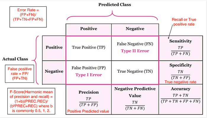 (image from https://medium.com/@cmukesh8688/evaluation-machine-learning-by-confusion-matrix-a4196051cf8d )
 Accuracy: $$ \dfrac{tp + tn}{tp + tn + fp + fn} $$
Precision (Positive Predictive Value): $$ \dfrac{tp}{tp + fp}$$
Recall (Sensitivity, hit rate, True Positive Rate): $$ \dfrac{tp}{tp + fn}$$
F1 score: Harmonic mean of precision and recall $$ 2 \cdot \dfrac{\text{precision} \cdot \text{recall}}{\text{precision} + \text{recall}} $$
High precision : Not many real emails predicted as spam
- High recall : Predicted most spam emails correctly
- Confusion matrix
Metrics for classification
In Chapter 1, you evaluated the performance of your k-NN classifier based on its accuracy. However, as Andy discussed, accuracy is not always an informative metric. In this exercise, you will dive more deeply into evaluating the performance of binary classifiers by computing a confusion matrix and generating a classification report.
You may have noticed in the video that the classification report consisted of three rows, and an additional support column. The support gives the number of samples of the true response that lie in that class - so in the video example, the support was the number of Republicans or Democrats in the test set on which the classification report was computed. The precision, recall, and f1-score columns, then, gave the respective metrics for that particular class.
Here, you'll work with the PIMA Indians dataset obtained from the UCI Machine Learning Repository. The goal is to predict whether or not a given female patient will contract diabetes based on features such as BMI, age, and number of pregnancies. Therefore, it is a binary classification problem. A target value of 0 indicates that the patient does not have diabetes, while a value of 1 indicates that the patient does have diabetes. As in Chapters 1 and 2, the dataset has been preprocessed to deal with missing values.
The dataset has been loaded into a DataFrame df and the feature and target variable arrays X and y have been created for you. In addition, sklearn.model_selection.train_test_split and sklearn.neighbors.KNeighborsClassifier have already been imported.
Your job is to train a k-NN classifier to the data and evaluate its performance by generating a confusion matrix and classification report.
Instructions
- Import classification_report and confusion_matrix from sklearn.metrics.
- Create training and testing sets with 40% of the data used for testing. Use a random state of 42.
- Instantiate a k-NN classifier with 6 neighbors, fit it to the training data, and predict the labels of the test set.
- Compute and print the confusion matrix and classification report using the confusion_matrix() and classification_report() functions.
import pandas as pd

df = pd.read_csv('./datasets/diabetes.csv')
df.tail(5)
X = df.iloc[:, :-1]
y = df.iloc[:, -1]
# Import necessary modules
from sklearn.metrics import classification_report
from sklearn.metrics import confusion_matrix

# Create training and test set
X_train, X_test, y_train, y_test = train_test_split(X, y, test_size=0.4, random_state=42)

# Instantiate a k-NN classifier: knn
knn = KNeighborsClassifier(n_neighbors=6)

# Fit the classifier to the training data
knn.fit(X_train, y_train)

# Predict the labels of the test data: y_pred
y_pred = knn.predict(X_test)

# Generate the confusion matrix and classification report
print(confusion_matrix(y_test, y_pred))
print(classification_report(y_test, y_pred))
Logistic regression and the ROC curve
- Logistic regression for binary classification
- Logistic regression outputs probabilities
- If the probability is greater than 0.5:
- The data is labeled '1'
- If the probability is less than 0.5:
- The data is labeled '0'
- Probability thresholds
- By default, logistic regression threshold = 0.5
- Not specific to logistic regression
- k-NN classifiers also have thresholds
- ROC curves (Receiver Operating Characteristic curve)
Building a logistic regression model
Time to build your first logistic regression model! As Hugo showed in the video, scikit-learn makes it very easy to try different models, since the Train-Test-Split/Instantiate/Fit/Predict paradigm applies to all classifiers and regressors - which are known in scikit-learn as 'estimators'. You'll see this now for yourself as you train a logistic regression model on exactly the same data as in the previous exercise. Will it outperform k-NN? There's only one way to find out!
from sklearn.linear_model import LogisticRegression

# Create training and test sets
X_train, X_test, y_train, y_test = train_test_split(X, y, test_size=0.4, random_state=42)

# Create the classifier: logreg
logreg = LogisticRegression(max_iter=1000)

# Fit the classifier to the training data
logreg.fit(X_train, y_train)

# Predict the labels of the test set: y_pred
y_pred = logreg.predict(X_test)

# Compute and print the confusion matrix and classification report
print(confusion_matrix(y_test, y_pred))
print(classification_report(y_test, y_pred))
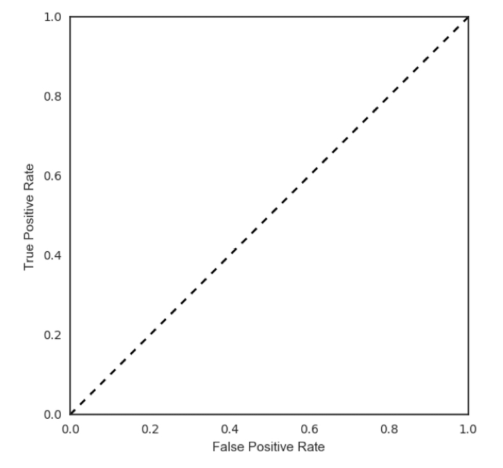
Plotting an ROC curve
Great job in the previous exercise - you now have a new addition to your toolbox of classifiers!
Classification reports and confusion matrices are great methods to quantitatively evaluate model performance, while ROC curves provide a way to visually evaluate models. As Hugo demonstrated in the video, most classifiers in scikit-learn have a .predict_proba() method which returns the probability of a given sample being in a particular class. Having built a logistic regression model, you'll now evaluate its performance by plotting an ROC curve. In doing so, you'll make use of the .predict_proba() method and become familiar with its functionality.
from sklearn.metrics import roc_curve

# Compute predicted probabilities: y_pred_prob
y_pred_prob = logreg.predict_proba(X_test)[:, 1]

# Generate ROC curve values: fpr, tpr, thresholds
fpr, tpr, thresholds = roc_curve(y_test, y_pred_prob)

# Plot ROC curve
plt.plot([0, 1], [0, 1], 'k--')
plt.plot(fpr, tpr)
plt.xlabel('False Positive Rate')
plt.ylabel('True Positive Rate')
plt.title('ROC Curve')

Precision-recall Curve
When looking at your ROC curve, you may have noticed that the y-axis (True positive rate) is also known as recall. Indeed, in addition to the ROC curve, there are other ways to visually evaluate model performance. One such way is the precision-recall curve, which is generated by plotting the precision and recall for different thresholds. As a reminder, precision and recall are defined as: $$ \text{Precision} = \dfrac{TP}{TP + FP} \\ \text{Recall} = \dfrac{TP}{TP + FN}$$ Study the precision-recall curve. Note that here, the class is positive (1) if the individual has diabetes.
from sklearn.metrics import precision_recall_curve

precision, recall, thresholds = precision_recall_curve(y_test, y_pred_prob)

plt.plot(recall, precision)
plt.xlabel('Recall')
plt.ylabel('Precision')
plt.title('Precision / Recall plot')

Area under the ROC curve (AUC)
- Larger area under the ROC curve = better model
AUC computation
Say you have a binary classifier that in fact is just randomly making guesses. It would be correct approximately 50% of the time, and the resulting ROC curve would be a diagonal line in which the True Positive Rate and False Positive Rate are always equal. The Area under this ROC curve would be 0.5. This is one way in which the AUC, which Hugo discussed in the video, is an informative metric to evaluate a model. If the AUC is greater than 0.5, the model is better than random guessing. Always a good sign!
In this exercise, you'll calculate AUC scores using the roc_auc_score() function from sklearn.metrics as well as by performing cross-validation on the diabetes dataset.
from sklearn.metrics import roc_auc_score
from sklearn.model_selection import cross_val_score

# Compute predicted probabilites: y_pred_prob
y_pred_prob = logreg.predict_proba(X_test)[:, 1]

# Compute and print AUC score
print("AUC: {}".format(roc_auc_score(y_test, y_pred_prob)))

# Compute cross-validated AUC scores: cv_auc
cv_auc = cross_val_score(logreg, X, y, cv=5, scoring='roc_auc')

# Print list of AUC scores
print("AUC scores computed using 5-fold cross-validation: {}".format(cv_auc))
Hyperparameter tuning
- Linear regression: Choosing parameters
- Ridge/Lasso regression: Choosing alpha
- k-Nearest Neighbors: Choosing n_neighbors
- Hyperparameters: Parameters like alpha and k
- Hyperparameters cannot be learned by fitting the model
- Choosing the correct hyperparameter
- Try a bunch of different hyperparameter values
- Fit all of them separately
- See how well each performs
- Choose the best performing one
- It is essential to use cross-validation
- Grid search cross-validation
Hyperparameter tuning with GridSearchCV
Like the alpha parameter of lasso and ridge regularization that you saw earlier, logistic regression also has a regularization parameter: $C$. $C$ controls the inverse of the regularization strength, and this is what you will tune in this exercise. A large $C$ can lead to an overfit model, while a small $C$ can lead to an underfit model.
The hyperparameter space for $C$ has been setup for you. Your job is to use GridSearchCV and logistic regression to find the optimal $C$ in this hyperparameter space.
You may be wondering why you aren't asked to split the data into training and test sets. Good observation! Here, we want you to focus on the process of setting up the hyperparameter grid and performing grid-search cross-validation. In practice, you will indeed want to hold out a portion of your data for evaluation purposes, and you will learn all about this in the next video!
from sklearn.linear_model import LogisticRegression
from sklearn.model_selection import GridSearchCV

# Setup the hyperparameter grid
c_space = np.logspace(-5, 8, 15)
param_grid = {'C':c_space}

# Instantiate a logistic regression classifier: logreg
logreg = LogisticRegression(max_iter=1000)

# Instantiate the GridSearchCV object: logreg_cv
logreg_cv = GridSearchCV(logreg, param_grid, cv=5)

# Fit it to the data
logreg_cv.fit(X, y)

# Print the tuned parameters and score
print("Tuned Logistic Regression Parameters: {}".format(logreg_cv.best_params_))
print("Best score is {}".format(logreg_cv.best_score_))
Hyperparameter tuning with RandomizedSearchCV
GridSearchCV can be computationally expensive, especially if you are searching over a large hyperparameter space and dealing with multiple hyperparameters. A solution to this is to use RandomizedSearchCV, in which not all hyperparameter values are tried out. Instead, a fixed number of hyperparameter settings is sampled from specified probability distributions. You'll practice using RandomizedSearchCV in this exercise and see how this works.
Here, you'll also be introduced to a new model: the Decision Tree. Don't worry about the specifics of how this model works. Just like k-NN, linear regression, and logistic regression, decision trees in scikit-learn have .fit() and .predict() methods that you can use in exactly the same way as before. Decision trees have many parameters that can be tuned, such as max_features, max_depth, and min_samples_leaf: This makes it an ideal use case for RandomizedSearchCV.
from scipy.stats import randint
from sklearn.tree import DecisionTreeClassifier
from sklearn.model_selection import RandomizedSearchCV

# Setup the parameters and distributions to sample from: param_dist
param_dist = {
    "max_depth": [3, None],
    "max_features": randint(1, 9),
    "min_samples_leaf": randint(1, 9),
    "criterion": ["gini", "entropy"],
}

# Instantiate a Decision Tree classifier: tree
tree = DecisionTreeClassifier()

# Instantiate the RandomizedSearchCV object: tree_cv
tree_cv = RandomizedSearchCV(tree, param_dist, cv=5)

# Fit it to the data
tree_cv.fit(X, y)

# Print the tuned parameters and score
print("Tuned Decision Tree Parameters: {}".format(tree_cv.best_params_))
print("Best score is {}".format(tree_cv.best_score_))
Hold-out set for final evaluation
- How well can the model perform on never before seen data?
- Using ALL data for cross-validation is not ideal
- Split data into training and hold-out set at the beginning
- Perform grid search cross-validation on training set
- Choose best hyperparameters and evaluate on hold-out set
Hold-out set in practice I: Classification
You will now practice evaluating a model with tuned hyperparameters on a hold-out set. The feature array and target variable array from the diabetes dataset have been pre-loaded as X and y.
In addition to $C$, logistic regression has a 'penalty' hyperparameter which specifies whether to use 'l1' or 'l2' regularization. Your job in this exercise is to create a hold-out set, tune the 'C' and 'penalty' hyperparameters of a logistic regression classifier using GridSearchCV on the training set.
from sklearn.model_selection import train_test_split, GridSearchCV
from sklearn.linear_model import LogisticRegression

# Create the hyperparameter grid
c_space = np.logspace(-5, 8, 15)
param_grid = {'C': c_space, 'penalty': ['l1', 'l2']}

# Instantiate the logistic regression classifier: logreg
logreg = LogisticRegression(max_iter=1000, solver='liblinear')

# Create train and test sets
X_train, X_test, y_train, y_test = train_test_split(X, y, test_size=0.4, random_state=42)

# Instantiate the GridSearchCV object: logreg_cv
logreg_cv = GridSearchCV(logreg, param_grid, cv=5)

# Fit it to the training data
logreg_cv.fit(X_train, y_train)

# Print the optimal parameters and best score
print("Tuned Logistic Regression Parameter: {}".format(logreg_cv.best_params_))
print("Tuned Logistic Regression Accuracy: {}".format(logreg_cv.best_score_))
Hold-out set in practice II: Regression
Remember lasso and ridge regression from the previous chapter? Lasso used the $L1$ penalty to regularize, while ridge used the $L2$ penalty. There is another type of regularized regression known as the elastic net. In elastic net regularization, the penalty term is a linear combination of the $L1$ and $L2$ penalties: $$ a * L1 + b * L2 $$
In scikit-learn, this term is represented by the 'l1_ratio' parameter: An 'l1_ratio' of 1 corresponds to an $L1$ penalty, and anything lower is a combination of $L1$ and $L2$.
In this exercise, you will GridSearchCV to tune the 'l1_ratio' of an elastic net model trained on the Gapminder data. As in the previous exercise, use a hold-out set to evaluate your model's performance.
Preprocess
df = pd.read_csv('./datasets/gm_2008_region.csv')
df.drop(labels=['Region'], axis='columns', inplace=True)
df.head()
X = df.drop('life', axis='columns').values
y = df['life'].values
from sklearn.linear_model import ElasticNet
from sklearn.metrics import mean_squared_error
from sklearn.model_selection import GridSearchCV, train_test_split

# Create train and test sets
X_train, X_test, y_train, y_test = train_test_split(X, y, test_size=0.4, random_state=42)

# Create the hyperparameter grid
l1_space = np.linspace(0, 1, 30)
param_grid = {'l1_ratio': l1_space}

# Instantiate the ElasticNet regressor: elastic_net
elastic_net = ElasticNet(max_iter=100000, tol=0.001)

# Setup the GridSearchCV object: gm_cv
gm_cv = GridSearchCV(elastic_net, param_grid, cv=5)

# Fit it to the training data
gm_cv.fit(X_train, y_train)

# Predict on the test set and compute metrics
y_pred = gm_cv.predict(X_test)
r2 = gm_cv.score(X_test, y_test)
mse = mean_squared_error(y_pred,y_test)
print("Tuned ElasticNet l1 ratio: {}".format(gm_cv.best_params_))
print("Tuned ElasticNet R squared: {}".format(r2))
print("Tuned ElasticNet MSE: {}".format(mse))
Preprocessing and pipelines
import numpy as np
import pandas as pd
import matplotlib.pyplot as plt
import seaborn as sns
Preprocessing data
- Dealing with categorical features
- Scikit-learn will note accept categorical features by default
- Need to encode categorical features numerically
- Convert to 'dummy variables'
- 0 : Obsevation was NOT that in category
- 1 : Observation was that category
Exploring categorical features
The Gapminder dataset that you worked with in previous chapters also contained a categorical 'Region' feature, which we dropped in previous exercises since you did not have the tools to deal with it. Now however, you do, so we have added it back in!
Your job in this exercise is to explore this feature. Boxplots are particularly useful for visualizing categorical features such as this.
df = pd.read_csv('./datasets/gm_2008_region.csv')
df.head()

# Create a boxplot of life expectancy per region
df.boxplot('life', 'Region', rot=60)
plt.savefig('./datasets/gm-boxplot.png', dpi=100)

Creating dummy variables
Scikit-learn does not accept non-numerical features. You saw in the previous exercise that the 'Region' feature contains very useful information that can predict life expectancy. For example, Sub-Saharan Africa has a lower life expectancy compared to Europe and Central Asia. Therefore, if you are trying to predict life expectancy, it would be preferable to retain the 'Region' feature. To do this, you need to binarize it by creating dummy variables, which is what you will do in this exercise.
df.columns

# Create dummy variables: df_region
df_region = pd.get_dummies(df)

# Print the columns of df_regions
print(df_region.columns)

# Create dummy variables with drop_first=True: df_region
df_region = pd.get_dummies(df, drop_first=True)

# Print the new columns of df_region
print(df_region.columns)
X = df_region.drop('life', axis='columns')
y = df_region['life']

from sklearn.linear_model import Ridge
from sklearn.model_selection import cross_val_score

# Instantiate a ridge regressor: ridge
ridge = Ridge(alpha=0.5, normalize=True)

# Perform 5-fold cross-validation: ridge_cv
ridge_cv = cross_val_score(ridge, X, y, cv=5)

# Print the cross-validated scores
print(ridge_cv)
Handling missing data
- Dropping missing data
- It can remove most of datas, we need a more robust method.
- Imputing missing data
- Making an educated guess about the missing values
- Example : Using the mean of the non-missing entries
Dropping missing data
You will see that there are certain data points labeled with a '?'. These denote missing values. As you saw in the video, different datasets encode missing values in different ways. Sometimes it may be a '9999', other times a 0 - real-world data can be very messy! If you're lucky, the missing values will already be encoded as NaN. We use NaN because it is an efficient and simplified way of internally representing missing data, and it lets us take advantage of pandas methods such as .dropna() and .fillna(), as well as scikit-learn's Imputation transformer Imputer().
In this exercise, your job is to convert the '?'s to NaNs, and then drop the rows that contain them from the DataFrame.
Preprocess
df = pd.read_csv('./datasets/house-votes-84.data', header=None)
df.columns = ['party', 'infants', 'water', 'budget', 'physician', 'salvador',
       'religious', 'satellite', 'aid', 'missile', 'immigration', 'synfuels',
       'education', 'superfund', 'crime', 'duty_free_exports', 'eaa_rsa']
df.replace({'n':0, 'y':1}, inplace=True)
df.head()

# Convert '?' to NaN
df[df == '?'] = np.nan

# Print the number of NaNs
print(df.isnull().sum())

# Print shape of original DataFrame
print('Shape of Original DataFrame: {}'.format(df.shape))

# Drop missing values and print shape fo new DataFrame
df = df.dropna()

# Print shape of new DataFrame
print("Shape of DataFrame After Dropping All Rows with Missing Values: {}".format(df.shape))
Imputing missing data in a ML Pipeline I
As you've come to appreciate, there are many steps to building a model, from creating training and test sets, to fitting a classifier or regressor, to tuning its parameters, to evaluating its performance on new data. Imputation can be seen as the first step of this machine learning process, the entirety of which can be viewed within the context of a pipeline. Scikit-learn provides a pipeline constructor that allows you to piece together these steps into one process and thereby simplify your workflow.
You'll now practice setting up a pipeline with two steps: the imputation step, followed by the instantiation of a classifier. You've seen three classifiers in this course so far: k-NN, logistic regression, and the decision tree. You will now be introduced to a fourth one - the Support Vector Machine, or SVM. For now, do not worry about how it works under the hood. It works exactly as you would expect of the scikit-learn estimators that you have worked with previously, in that it has the same .fit() and .predict() methods as before.
Note:
sklearn.preprocessing.Imputeris replaced withsklearn.imputer.SimpleImputerfrom version 0.20
from sklearn.impute import SimpleImputer
from sklearn.svm import SVC

# Setup the Imputation transformer: imp
imp = SimpleImputer(missing_values=np.nan, strategy='most_frequent')

# Instantiate the SVC classifier: clf
clf = SVC()

# Setup the pipeline with the required steps: steps
steps = [('imputation', imp),
        ('SVM', clf)]
Imputing missing data in a ML Pipeline II
Having setup the steps of the pipeline in the previous exercise, you will now use it on the voting dataset to classify a Congressman's party affiliation. What makes pipelines so incredibly useful is the simple interface that they provide. You can use the .fit() and .predict() methods on pipelines just as you did with your classifiers and regressors!
Preprocess
X = df.drop('party', axis='columns')
y = df['party']

from sklearn.model_selection import train_test_split
from sklearn.metrics import classification_report
from sklearn.pipeline import Pipeline

# Setup the pipeline steps: steps
steps = [('imputation', SimpleImputer(missing_values=np.nan, strategy='most_frequent')),
        ('SVM', SVC())]

# Create the pipeline: pipeline
pipeline = Pipeline(steps)

# Create training and test sets
X_train, X_test, y_train, y_test = train_test_split(X, y, test_size=0.3, random_state=42)

# Fit the pipeline to the train set
pipeline.fit(X_train, y_train)

# Predict the labels of the test set
y_pred = pipeline.predict(X_test)

# Compute metrics
print(classification_report(y_test, y_pred))
Centering and scaling
- Why scale your data?
- Many models use some form of distance to inform them
- Features on larger scales can unduly influence the model
- Example: k-NN uses distance explicitly when making predictions
- Want features to be on a similar scale
- Normalizing (or scaling and centering)
- Ways to normalize your data
- Standardization: Subtract the mean and divide by variance
- All features are centered around zero and have variance one
- Can also subtract the minimum and divide by the range
- Minimum zero and maximum one
- Can also normalize so the data ranges from -1 to +1
Centering and scaling your data
You will now explore scaling for yourself on a new dataset - White Wine Quality! Hugo used the Red Wine Quality dataset in the video. We have used the 'quality' feature of the wine to create a binary target variable: If 'quality' is less than 5, the target variable is 1, and otherwise, it is 0.
Notice how some features seem to have different units of measurement. 'density', for instance, takes values between 0.98 and 1.04, while 'total sulfur dioxide' ranges from 9 to 440. As a result, it may be worth scaling the features here. Your job in this exercise is to scale the features and compute the mean and standard deviation of the unscaled features compared to the scaled features.
Preprocess
# Fit the pipeline to the training set: knn_scaled
knn_scaled = pipeline.fit(X_train, y_train)

# Instantiate and fit a k-NN classifier to the unscaled data
knn_unscaled = KNeighborsClassifier().fit(X_train, y_train)

# Compute and print metrics
print('Accuracy with Scaling: {}'.format(knn_scaled.score(X_test, y_test)))
print('Accuracy without Scaling: {}'.format(knn_unscaled.score(X_test, y_test)))

df = pd.read_csv('./datasets/white_wine.csv', sep=';')

df['quality'] = df['quality'] < 5
X = df.drop('quality', axis='columns').values
y = df['quality'].values
df.head()
# Import scale
from sklearn.preprocessing import scale
import numpy as np

# Scale the features: X_scaled
X_scaled = scale(X)

# Print the mean and standard deviation of the unscaled features
print("Mean of Unscaled Features: {}".format(np.mean(X)))
print("Standard Deviation of Unscaled Features: {}".format(np.std(X)))

# Print the mean and standard deviation of the scaled features
print("Mean of Scaled Features: {}".format(np.mean(X_scaled)))
print("Standard Deviation of Scaled Features: {}".format(np.std(X_scaled)))
Centering and scaling in a pipeline
With regard to whether or not scaling is effective, the proof is in the pudding! See for yourself whether or not scaling the features of the White Wine Quality dataset has any impact on its performance. You will use a k-NN classifier as part of a pipeline that includes scaling, and for the purposes of comparison, a k-NN classifier trained on the unscaled data has been provided.
from sklearn.preprocessing import StandardScaler
from sklearn.pipeline import Pipeline
from sklearn.model_selection import train_test_split
from sklearn.neighbors import KNeighborsClassifier

# Setup the pipeline steps: steps
steps = [('scaler', StandardScaler()),
        ('knn', KNeighborsClassifier())]

# Create the pipeline: pipeline
pipeline = Pipeline(steps)

# Create train and test sets
X_train, X_test, y_train, y_test = train_test_split(X, y, test_size=0.3, random_state=42)
Bringing it all together I: Pipeline for classification
It is time now to piece together everything you have learned so far into a pipeline for classification! Your job in this exercise is to build a pipeline that includes scaling and hyperparameter tuning to classify wine quality.
You'll return to using the SVM classifier you were briefly introduced to earlier in this chapter. The hyperparameters you will tune are C and gamma. C controls the regularization strength. It is analogous to the C you tuned for logistic regression in Chapter 3, while gamma controls the kernel coefficient: Do not worry about this now as it is beyond the scope of this course.
from sklearn.metrics import classification_report, accuracy_score
from sklearn.model_selection import GridSearchCV, train_test_split
from sklearn.svm import SVC
from sklearn.pipeline import Pipeline
from sklearn.preprocessing import StandardScaler

# Setup the pipeline
steps = [('scaler', StandardScaler()),
        ('SVM', SVC())]

pipeline = Pipeline(steps)

# Specify the hyperparameter space
parameters = {'SVM__C':[1, 10, 100],
             'SVM__gamma':[0.1, 0.01]}

# Create train and test sets
X_train, X_test, y_train, y_test = train_test_split(X, y, test_size=0.2, random_state=21)

# Instantiate the GridSearchCV object: cv
cv = GridSearchCV(pipeline, param_grid=parameters, cv=3)

# Fit to the training set
cv.fit(X_train, y_train)

# Predict the labels of the test set: y_pred
y_pred = cv.predict(X_test)

# Compute and print metrics
print("Accuracy: {}".format(cv.score(X_test, y_test)))
print(classification_report(y_test, y_pred))
print("Tuned Model Parameters: {}".format(cv.best_params_))
Bringing it all together II: Pipeline for regression
For this final exercise, you will return to the Gapminder dataset. Guess what? Even this dataset has missing values that we dealt with for you in earlier chapters! Now, you have all the tools to take care of them yourself!
Your job is to build a pipeline that imputes the missing data, scales the features, and fits an ElasticNet to the Gapminder data. You will then tune the l1_ratio of your ElasticNet using GridSearchCV.
Preprocess
df = pd.read_csv('./datasets/gm_2008_region.csv')
df.head()

df.drop(['Region'], axis='columns', inplace=True)
X = df.drop('life', axis='columns').values
y = df['life'].values

from sklearn.impute import SimpleImputer
from sklearn.preprocessing import StandardScaler
from sklearn.linear_model import ElasticNet
from sklearn.pipeline import Pipeline

# Setup the pipeline steps: steps
steps = [('imputation', SimpleImputer(missing_values=np.nan, strategy='mean')),
        ('scaler', StandardScaler()),
        ('elasticnet', ElasticNet(tol=0.6))]

# Create the pipeline: pipeline
pipeline = Pipeline(steps)

# Specify the hyperparameter space
parameters = {'elasticnet__l1_ratio': np.linspace(0, 1, 30)}

# Create train and test sets
X_train, X_test, y_train, y_test = train_test_split(X, y, test_size=0.4, random_state=42)

# Create the GridSearchCV object: gm_cv
gm_cv = GridSearchCV(pipeline, param_grid=parameters, cv=3)

# Fit to the training set
gm_cv.fit(X_train, y_train)

# Compute and print the metrics
r2 = gm_cv.score(X_test, y_test)
print("Tuned ElasticNet Alpha: {}".format(gm_cv.best_params_))
print("Tuned ElasticNet R squared: {}".format(r2))